I don’t know if you know this about me, but I have a little bit of a problem with trying to make things perfect.
Turns out, I also have a bit of a problem with spending my entire life looking at screens.
So when I found myself repeatedly drawn to different types of mixed media, an art journal seemed like the perfect solution to encourage my creativity. As Ashlee Gadd says, Go where the light is. I picked up an old sketchbook I had lying around and let loose.
My method was basically this: whenever you stumble upon an idea, pattern, or design that inspires you, use whatever you have around to put it on paper. This led me to try out a lot of different mediums. I used magazine clippings, film photos, book pages, hand-carved stamps, stickers, paint pens, junk mail, fabric scraps. I collaged, I hand lettered, I painted, I sketched. I didn’t buy anything special for putting in my art journal; in fact, most of the contents are rejects that would have otherwise made their way to the garbage.
Most of all, I tried not to sweat about whether it was “perfect” and just let myself have fun. The final product was less important than getting out of my own head and trying new things.
For a chill flip through, check out the YouTube video:
And if you want more details, read on. Here’s a little tour of each page: what inspired me, what I used, how I made it.
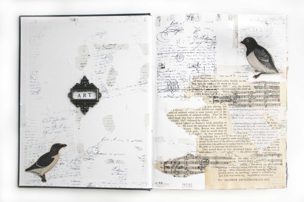
Inside the cover, I wanted to make a sort of “title page” that would introduce what this book was all about. I found this metal bookplate in a grab bag of craft supplies I got at a garage sale, and I thought it was perfect to frame the simple word “ART”. I surrounded it with stamps and clippings from book pages. (Warning for book lovers: there are a lot of torn and cut book pages throughout this sketchbook. Proceed with caution.)
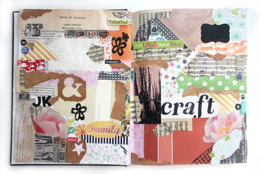
I’ll admit, this spread is a bit more chaotic than what I’m usually drawn to. But, like I said, I’m not going for aesthetic, I’m going for anything and everything that gets me working with my hands. It’s mostly a mix of craft paper scraps, unused stickers, book page scraps, and misprinted stamping. And honestly, it’s not bad looking for a page full of trash.
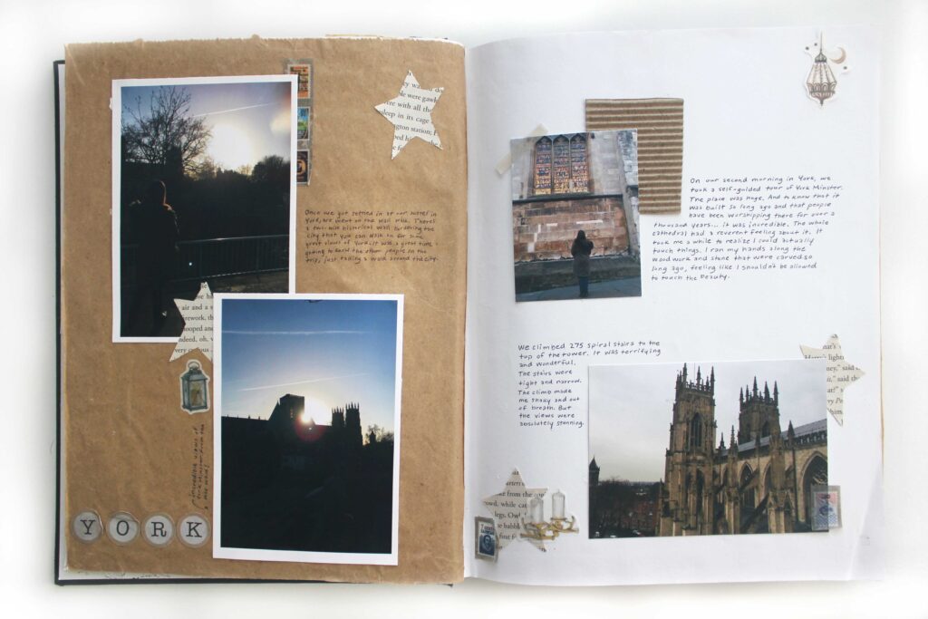
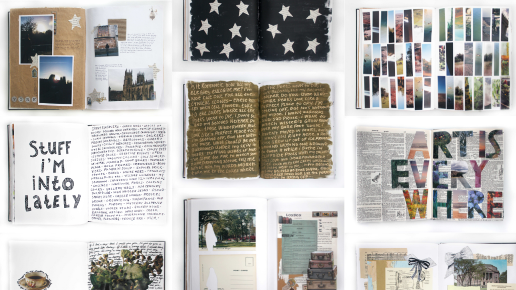
So, you know how I said I had this sketchbook just lying around? Well, that’s because it was initially going to be a scrapbook of my trip to the UK back in college. I got about five pages in before I decided I hated it and ripped out all of the photos. (It took a few years, but I did finally find a scrapbook that I liked!) I still had that pile of photos with nowhere else to put them, so I decided to make a spread that paid homage to this book’s original purpose.
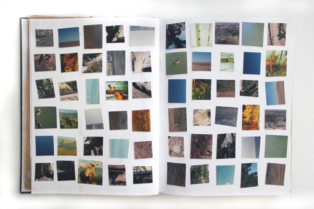
I shared a bit about this spread in a blog post last year. All of these little squares are cut from old film photos that I had culled from my boxes of childhood pictures. (Don’t worry, I didn’t cut up anything important–just some duplicates and some objectively pretty bad pictures.) As happens with a lot of creative work, I found a deep meaning in this collage as I worked on it. Each piece of it is a sliver of a picture that I barely remember, yet they still make up my past. They’re pinhole glimpses into past moments that are inside me.
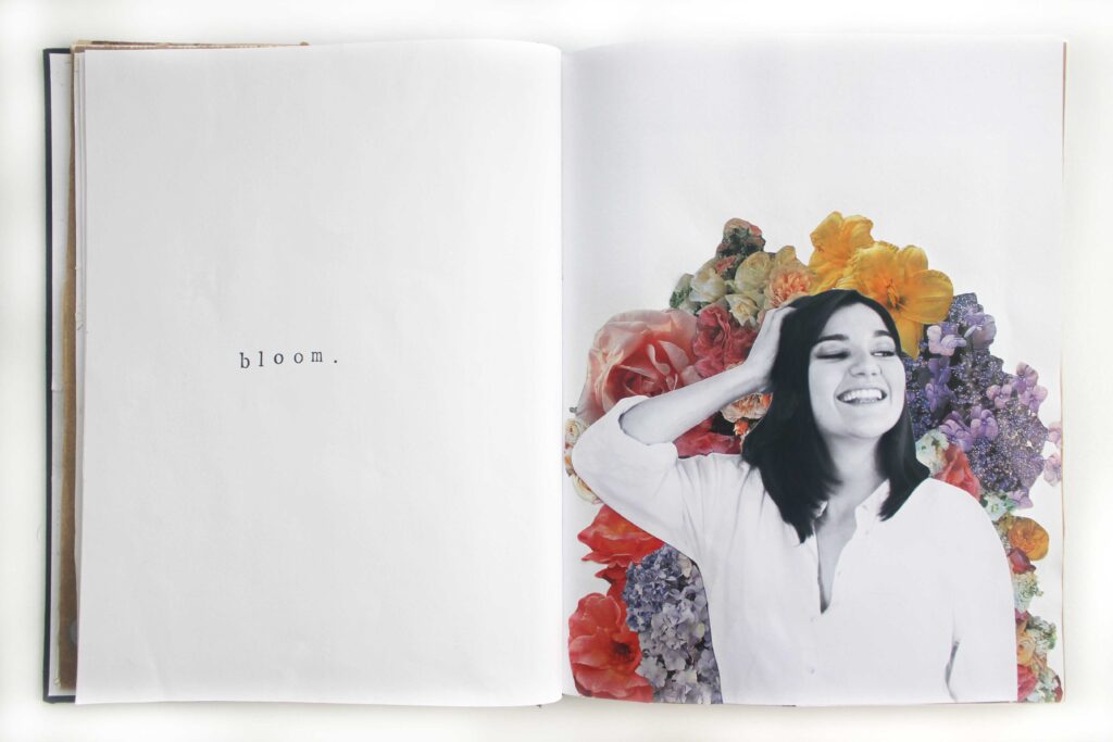
This spread was so much fun. I’ve collected a whole stack of flower photos ripped out of magazine pages, and looking at them, I knew I wanted to make something like this. I printed a big black and white photo of myself and collaged a burst of magazine flowers behind me. (You can read more about how I made this spread here.) I wasn’t sure what to put on the other page, and to be honest, I was a bit scared I’d ruin the spread if I messed with it anymore. The whole time I collaged, I had the word bloom in my head, so I stamped that on the opposite page. I shared the whole process in a blog post if you’d like to create your own.
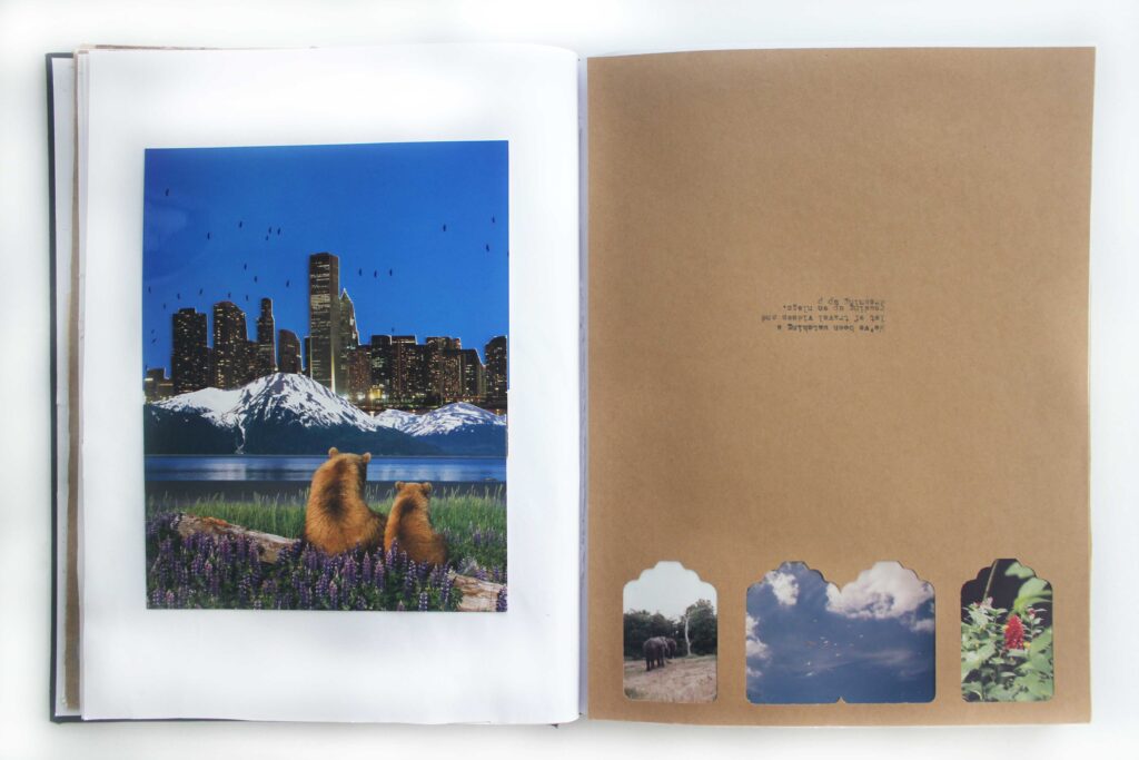
I actually made this bear collage years ago using postcards and film photos, but I never had anywhere for it to live. This was the perfect place for it. Something I think is really fun is that you can fold all of the different pieces down one at a time, so I taped it down lightly to make sure I still had access to that. On the opposite page, I glued this piece of kraft paper–a scrapbooking misprint (as you can tell by the oddly placed typewriter words) with some tag punches taken out for another project. As I came across it in my pile of scrap paper, I pictured the punches as little windows and knew it would come to life with bits of film photos peeking from behind it.

This spread is another made from old crafts. These tiny pages were made years ago when I was experimenting with junk journaling. It wasn’t a project I pursued for long, but I did keep the pages I was proud of. Instead of leaving them buried in my collage pile, I mounted one side onto scrap kraft paper and glued them into my art journal.
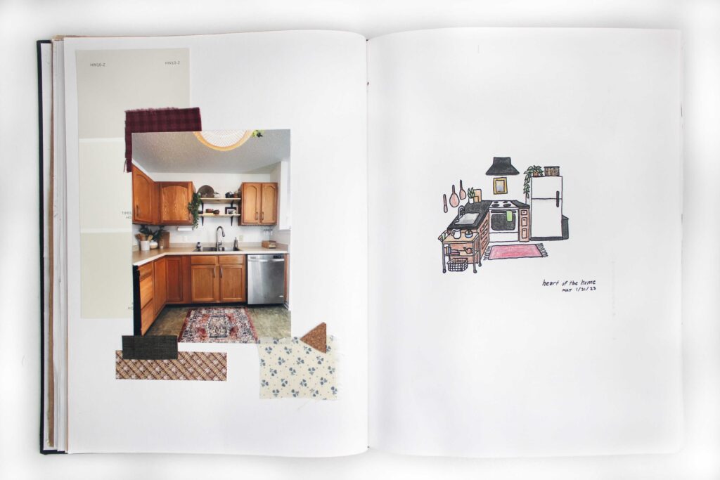
On this page, I wanted to test out sketching in my art journal. I drew out a kitchen concept that I had been imagining, which turned out okay. But, months later, we fixed up our kitchen in that same style, and I had misprints of the transformation photos meant for my scrapbook. I turned the spread into a comparison of the kitchen I imagined alongside how my real kitchen turned out.
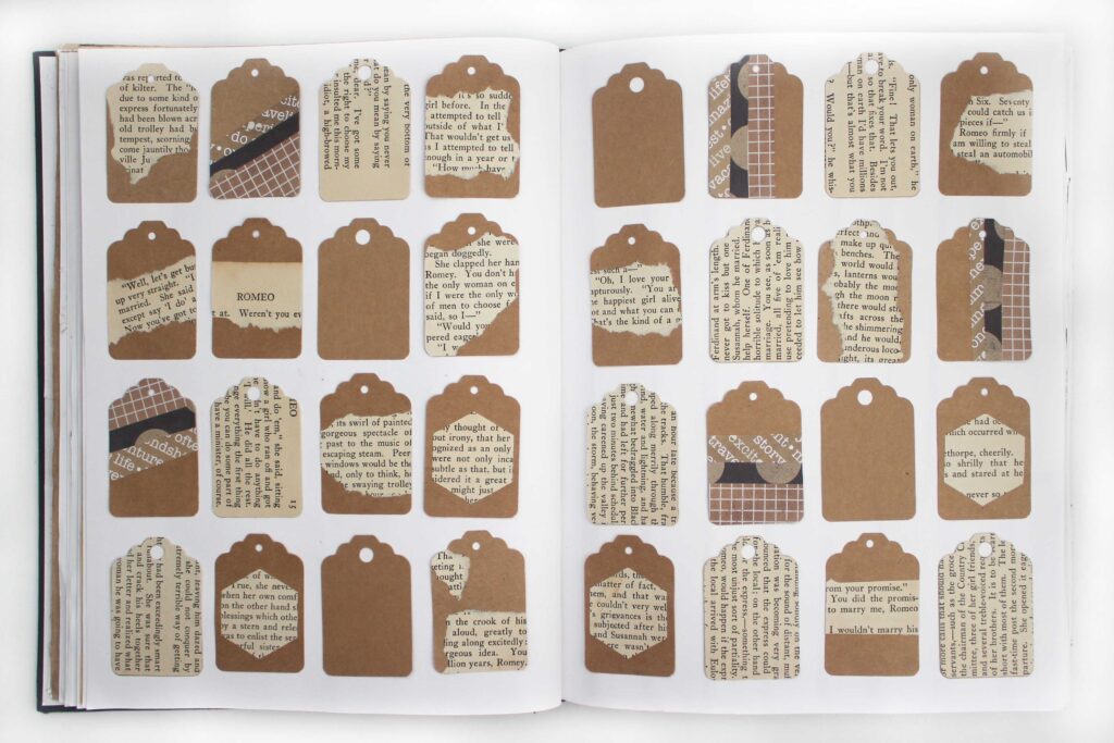
Another relic of my junk journaling days: tons and tons of tags. At one point I’d thought of selling collaged tags like this, but ultimately decided not to pursue it, leaving me with a big bag of tags. As I was cleaning out my collage supplies, I thought this would be a great home for them. I filled in the gaps with some plain kraft paper tags (remember those punches from a few pages ago?)
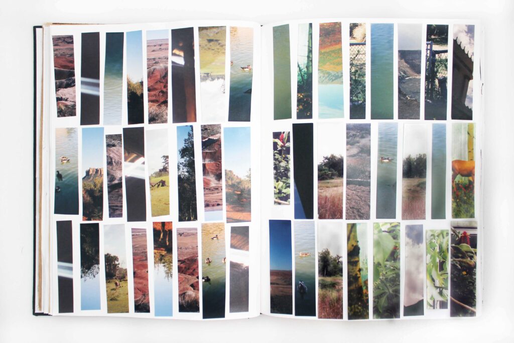
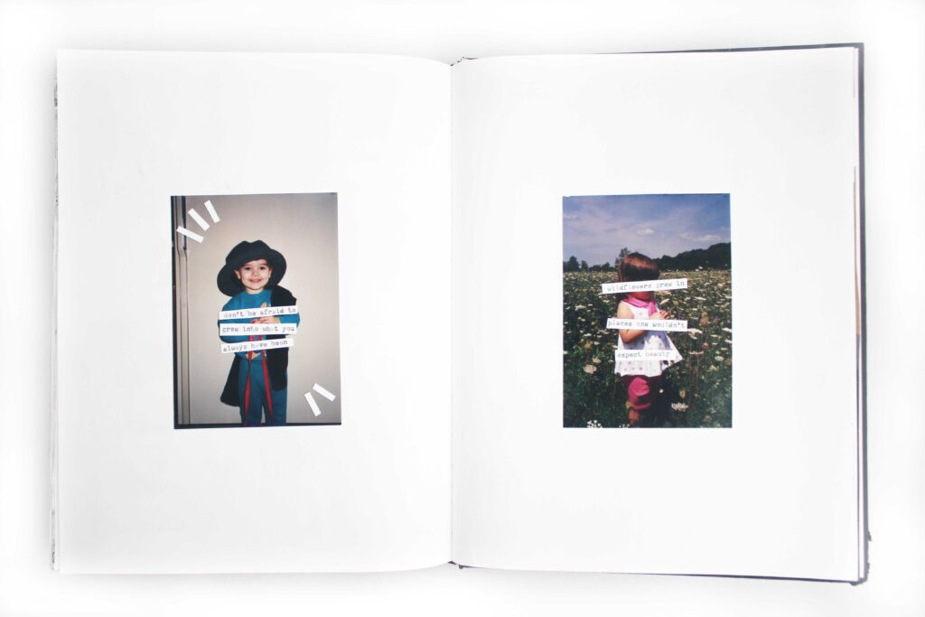
This is one of my absolute favorite pages. Same concept as the other film photo page, just with strips instead of squares.
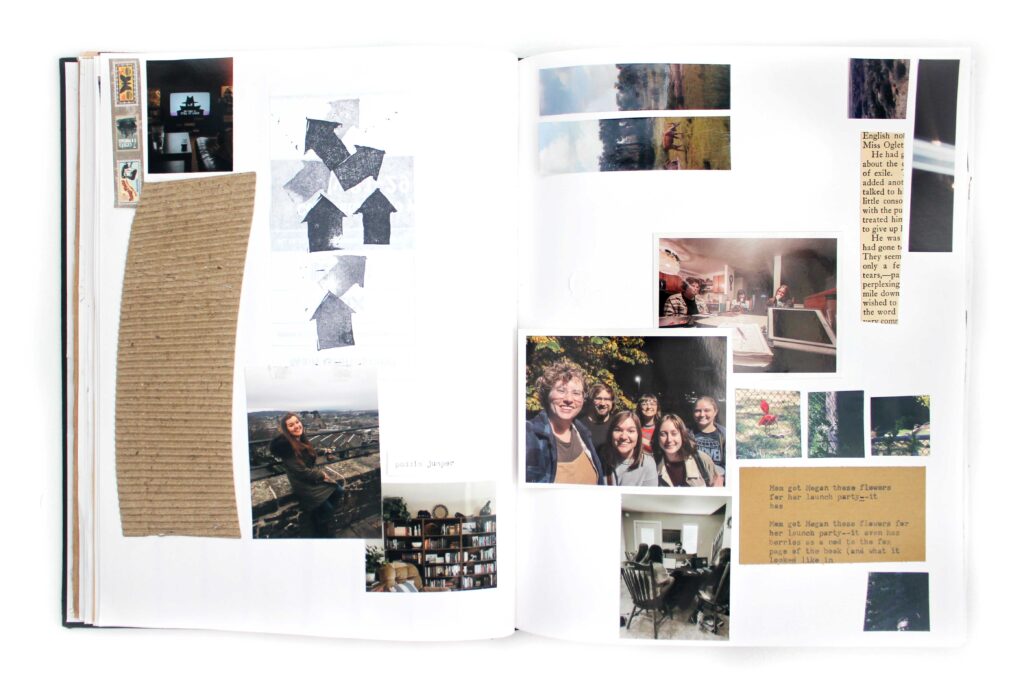
This is another “junk” page. The spread is entirely comprised of scraps and trash from my scrapbook or from other pages in this book. There are a lot of leftover bits from the film photos, picture misprints, typewriter typos, and scraps of paper.
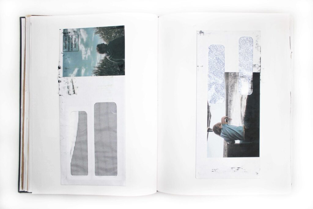
For this page, I was inspired by artist @emrauta on Instagram and his “printing photos on junk mail” series. I was obsessed from the moment I discovered his account, and I knew I had to try it for myself. I dug up these old photos of my husband and my sister and gave it a shot. They got a bit inked up in the process, but I think that just adds to the charm.
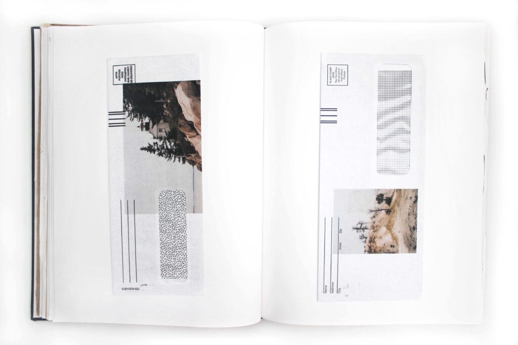
Printing on junk mail part 2: my favorite one. The first photo is from Acadia National Park, and the second is from Yellowstone. These are some of my favorite pictures I’ve taken, and I loved how the photos aligned on the envelopes. (I did my best to strategically place the photos, but it really was a crap shoot whether they would print where I expected them to.)
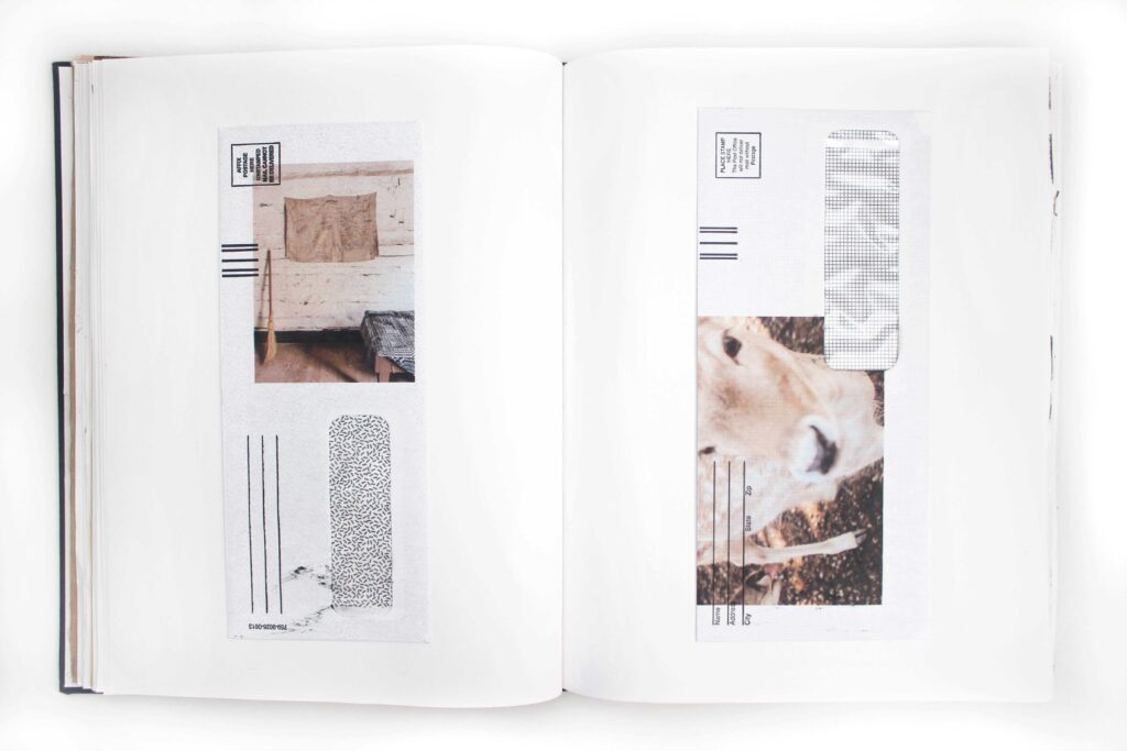
Printing on junk mail part 3: the last one. More photographs I’m proud of, more fun playing with the alignment.
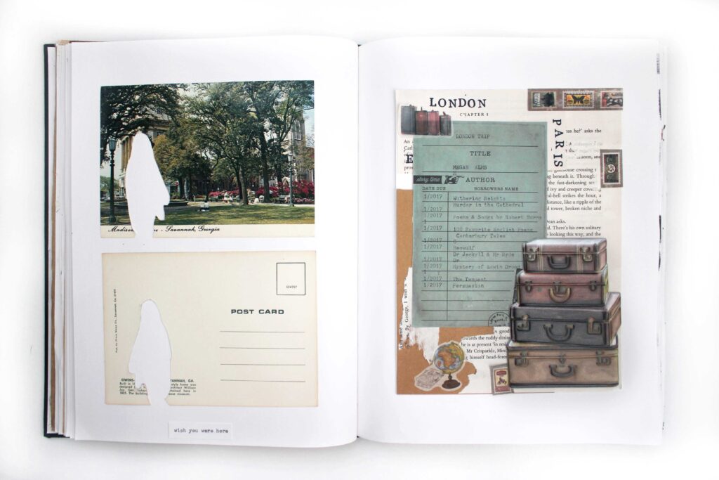
Remember how I said this sketchbook was initially meant to be a scrapbook of a UK trip? That right-hand page is another remnant of that scrapbook. It was once a full page in this sketchbook, then cut down and rearranged to fit in the new and improved scrapbook, then finally removed from the scrapbook altogether and moved back here. On the left-hand page, I wanted to continue that travel motif. I was inspired to make these “wish you were here” postcards by a collage I saw on Pinterest, whose artist I cannot track down for the life of me. (I’ll keep you posted if my internet stalking skills lead me back to their work.)
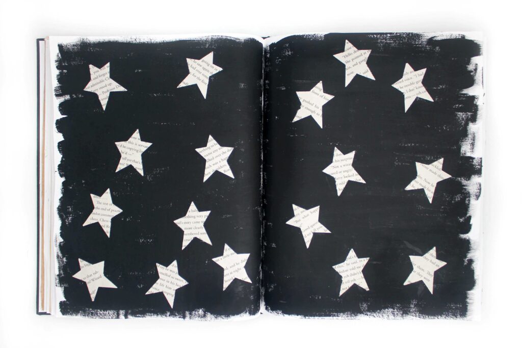
I made these book page stars years ago, and they’ve been in a bag in my closet ever since. That is, until I imagined this page with them scattered across a black acrylic sky. I really like this one. Super simple, but super cool.
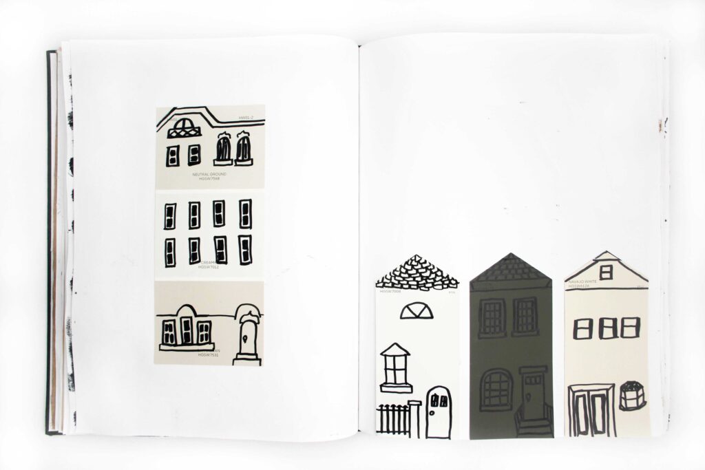
After my kitchen makeover project, I had quite a few paint samples lying around. I had the idea to turn them into little houses using permanent marker. I didn’t worry too much about making straight lines, keeping perfect proportions, or even really planning what parts to add to each house. I just kind of went with what felt right, and I think that gives them an organic, childlike quality.
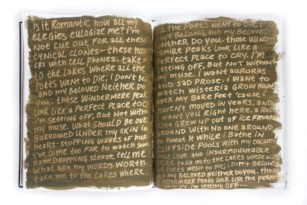
This is another one of my absolute favorite pages. I wanted to experiment with hand lettering, so I wrote out the lyrics of Taylor Swift’s “the lakes” in gold paint pen on top of olive green acrylic paint. The color combo feels so magical to me; in the right lighting, the gold completely disappears, then lights up when you turn the page.
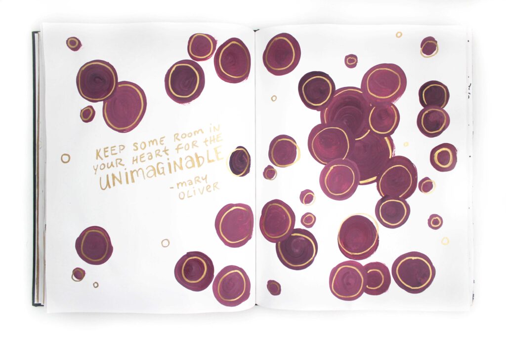
I wanted to play around more with paint, so I mixed this dark fuchsia color and just started making circles. Once they dried, I made it all feel a bit more “finished” with a gold paint pen and some more hand lettering.
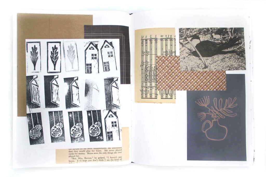
This is another collage of scraps: book pages, craft paper, a fading envelope, frame filler, a tester page from my hand-carved stamps.
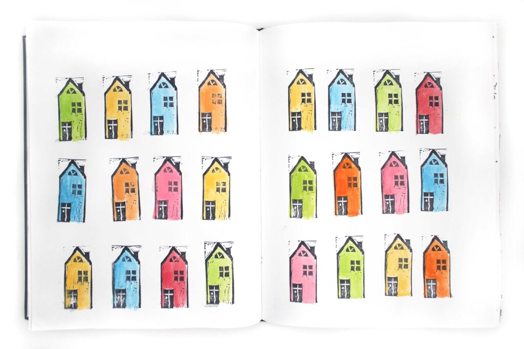
Of all of the stamps I carved from the previous page, this little house was definitely my favorite. I had the idea to stamp out a whole neighborhood of them and watercolor paint them bright colors, almost like mini Casitas from the movie Encanto.
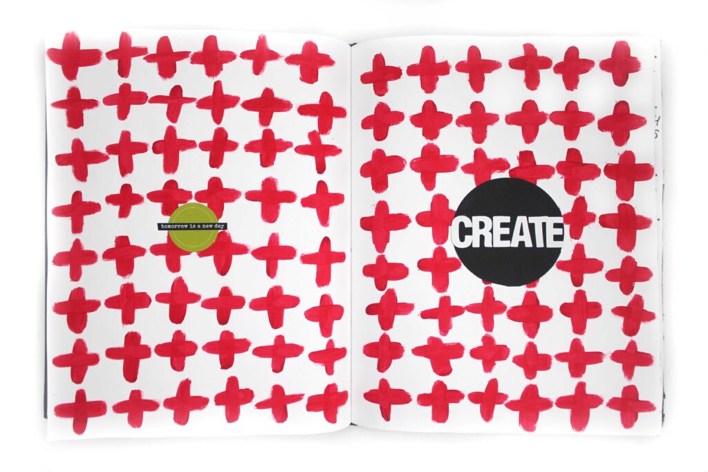
Watching Ali Edwards and her mixed media art made me really want to recreate her red plus sign patterns. I used a few different scrapbook stickers on top, including this “tomorrow is a new day” sticker from Ali’s shop.
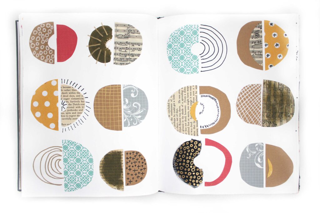
In looking at more and more mixed media art, I came across a few artists who made these half circle designs that I was so intrigued to try. I cut and painted everything by eye to create a more organic look.
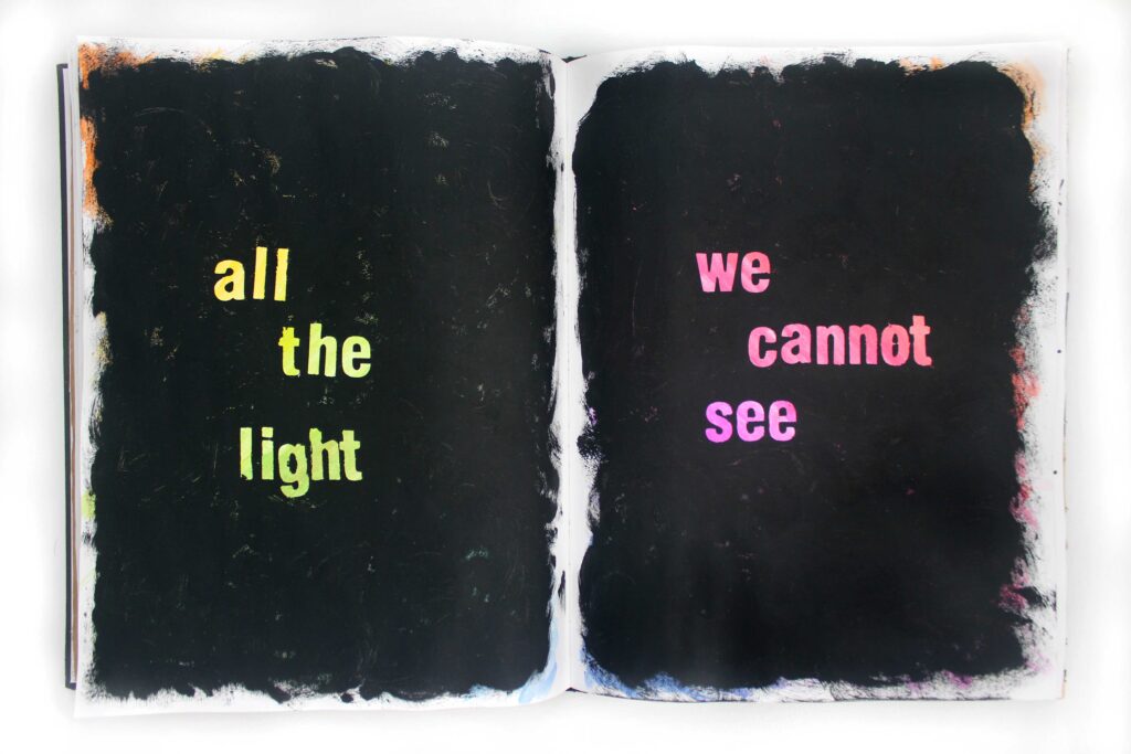
In watching Ali Edwards make mixed media, I sometimes find myself agonizing when what I consider to be already lovely work gets covered up by another layer of media. But that’s kind of the whole point, isn’t it? To make stuff for the sake of making and not for the sake of a product? So I made this page as an exercise in making things and letting them go. I covered the whole spread in a rainbow of watercolor, then painted over all of it in black acrylic. But I used some letter stickers as stencils to let some of the original color peek through. In making this spread, I reminded myself that in all forms of creativity, a lot of beautiful work may never reach anyone’s eyes but my own.
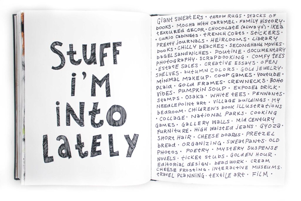
I wanted to play around more with hand lettering, so this page is pretty simple. I just listed out some stuff I’ve been thinking about and loving lately, from foods to hobbies to design choices.
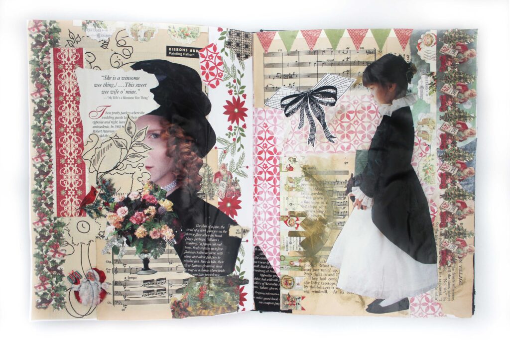
This spread is just a classic, traditional collage. I used a bunch of Christmas stuff from a garage sale grab bag combined with book pages, magazine cutouts, and craft paper. Oh, and a ton of ModPodge.
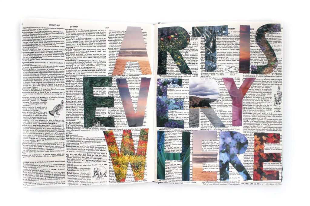
How many times am I allowed to say a spread is my favorite spread? Because this is one of my favorite spreads. I cobbled together a few different dictionary pages to make them cover the whole spread background, then freehand cut out the letters from film photos and magazine pages.
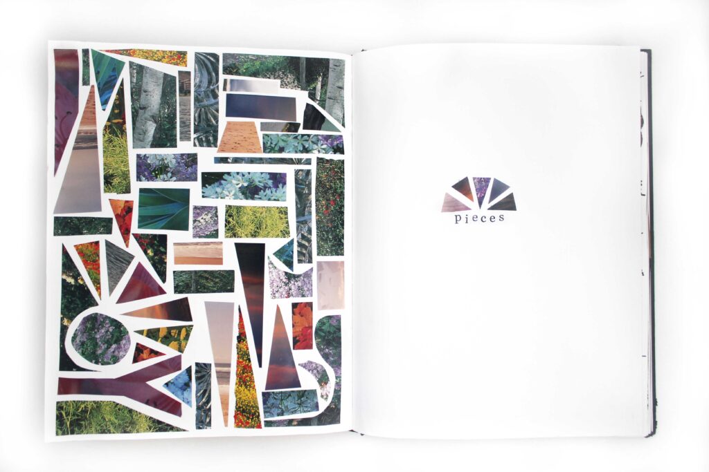
I had a lot of scraps leftover from cutting out the letters on the previous spread, and of course I couldn’t just throw them out. I had enough scraps to put together this photo mosaic on one page, and decided to leave the other page simple by just stamping out the word “pieces.”
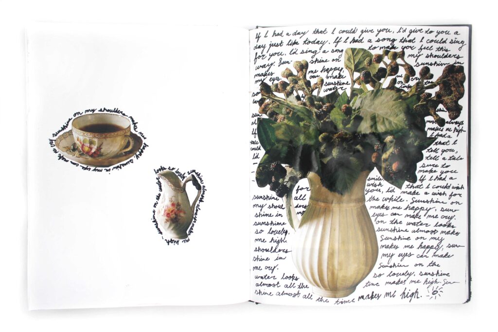
My love of housewares has officially infiltrated my art journal. I cut these dishes out from old magazine pages, and surrounded them with the lyrics of “Sunshine on My Shoulder” by John Denver. The handwriting turned out… not very good. Turns out it’s not super easy to write in tiny cursive with a paint pen, especially if your cursive has barely improved since second grade. I kind of don’t hate it, though?
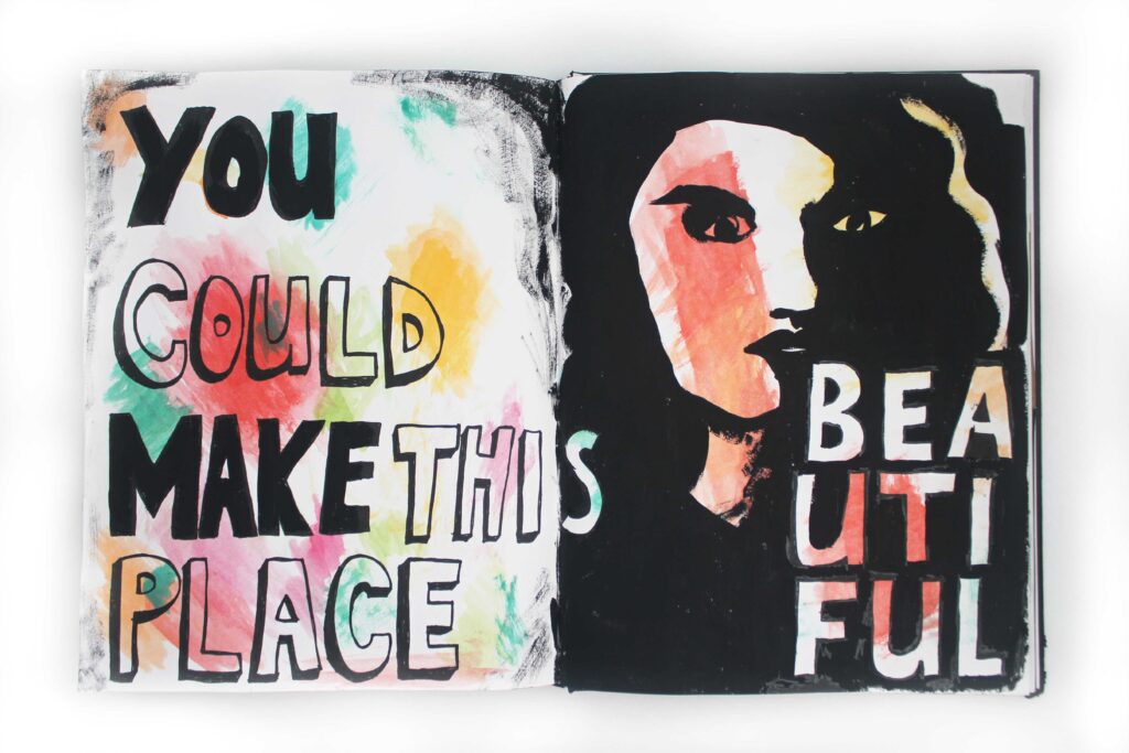
This spread actually started out with just a color combo I liked with watercolors. It needed something on top of it, of course, so I used paint to write out this line from the poem Good Bones by Maggie Smith, along with a freehand portrait.
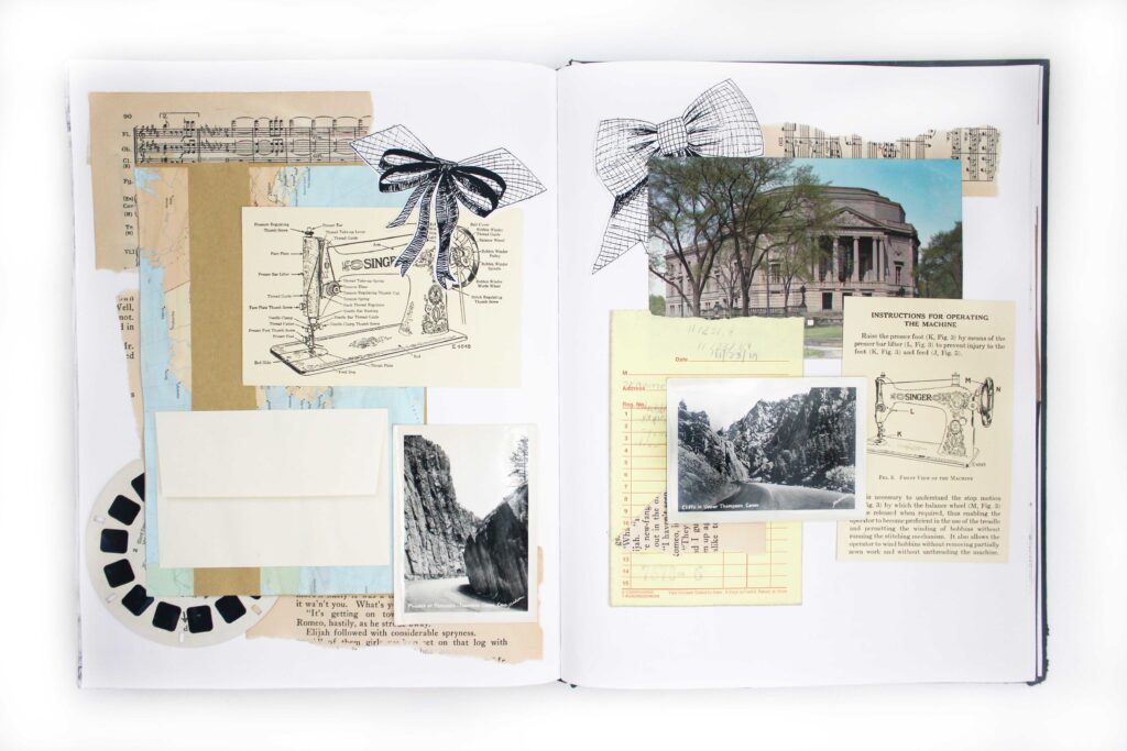
This page is mostly a collection of vintage papers: some photos, some book pages, a postcard, a ViewMaster slide (remember those?!) You’ll also spot another relic from my junk journal days: a map with kraft paper and an envelope pasted onto it.
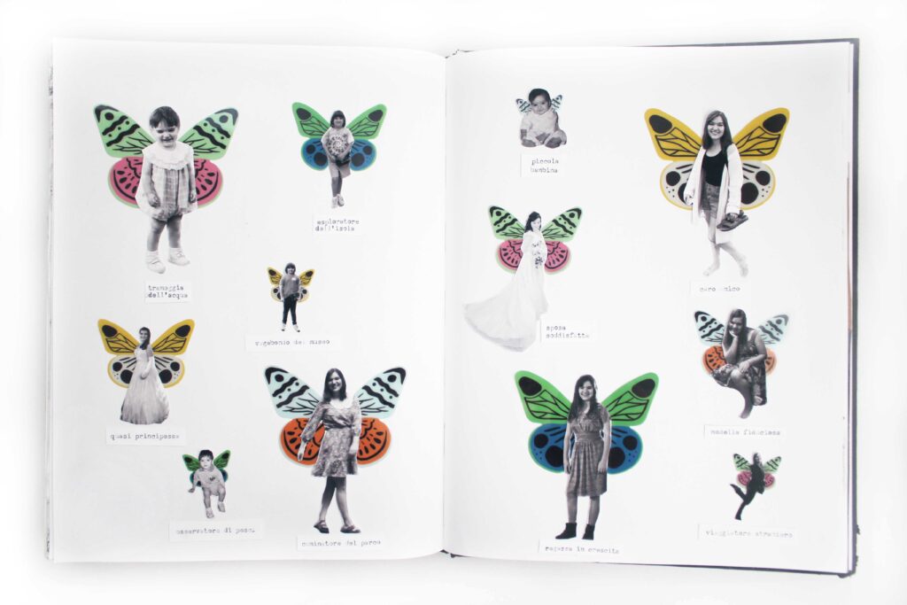
When I put the Studio Calico Next Chapter scrapbook kit on my Christmas list, I immediately thought of a collage by Louise Richardson. I knew I wouldn’t use these butterflies in my annual scrapbook, but I was itching to make my own version of those little girls with butterfly wings. I collected pictures of myself from all throughout my life, printing them in grayscale and pasting wings onto each of them. I had the idea to “label” them all as one would a butterfly collection, creating a Latin name for each based on what that photo represents about me. The problem arose in the translation: unsurprisingly, Google’s Latin translations aren’t the best. When I would translate a phrase from English to Latin and back again, the results were complete nonsense. So I gave up on Latin and went with Italian, which Google is a lot better with and is similar enough to English and Spanish that I could actually read them pretty well.
I was inspired by a collage by Haley Hendrick to collage some of my childhood film photos. (Don’t worry, both of these photos are doubles, and there are plenty more copies!)
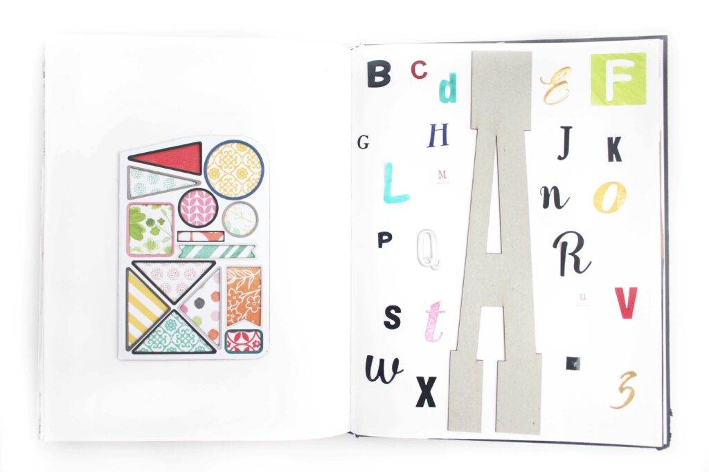
On this spread, I was playing with mixing colors and patterns. On the left-hand page, I used the background of a chipboard sticker sheet, filling in the holes where the stickers used to be with brightly colored craft paper. On the other page, I wanted to use this giant letter A that I got in a craft grab bag. I’ve had this idea for a while to write something with all of the different letter stickers and stamps that I have, so I wrote out the rest of the alphabet with a variety of mediums.
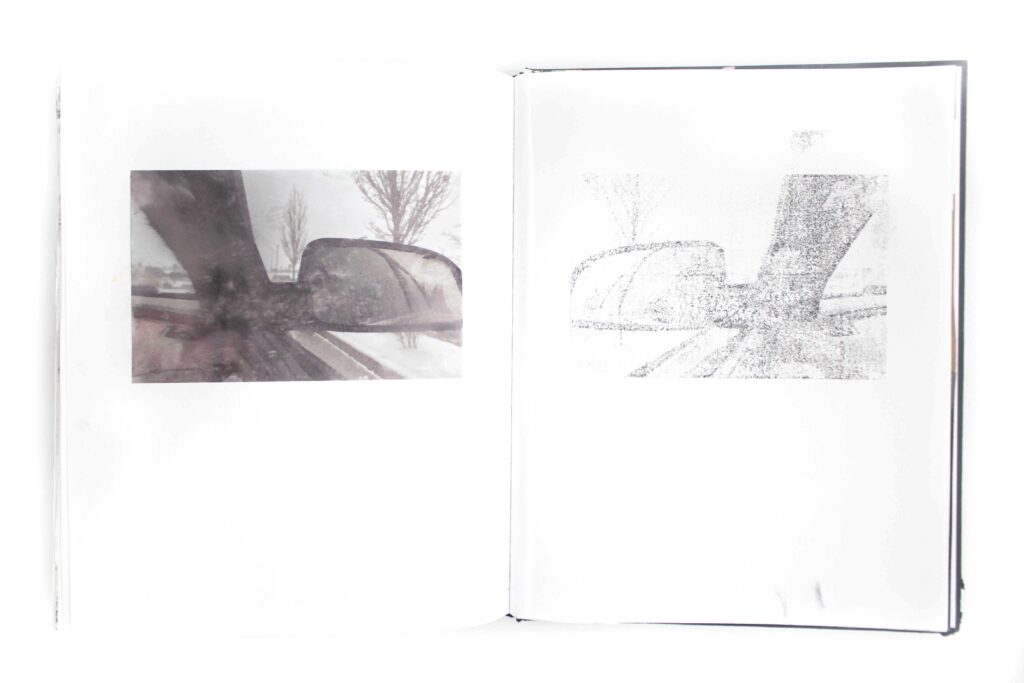
While printing photos for my scrapbook, accidentally printed one of the pictures on the back of my photo paper, leaving the ink to smudge right off the page. I immediately wanted to try pressing that excess ink into a page to see what it would leave. On this spread, you can see the “oops” picture and the ink print that it left.
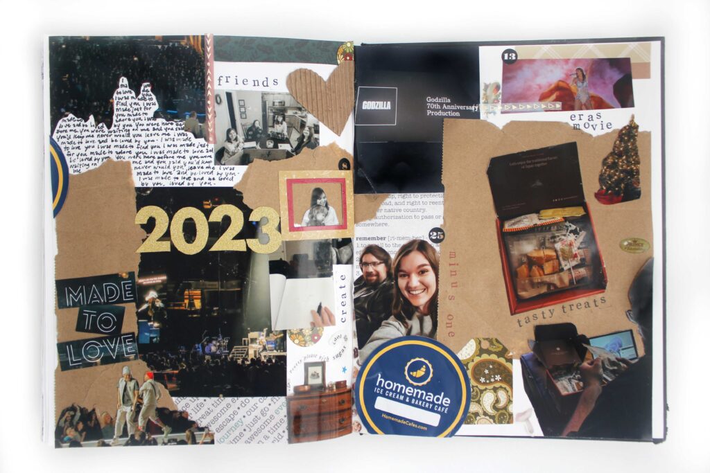
On the final page of this art journal, I wanted to put together something that reflected the year in which I made it. I had quite a few misprints and unused photos from my annual scrapbook, so I experimented with cutting out different parts of the pictures and filling in the space with words and papers. It’s completely different from the type of scrapbooking I usually do, so it was a really fun experiment.
Making this art journal was an exercise in following where my creativity leads, and it was really rewarding. I made a lot of pages that I wasn’t super happy with, but I also made some of the best visual art I’ve ever produced. As with all art, you have to make a few duds to get one masterpiece. I already have so many more plans that I want to try, so I’ll definitely be continuing the practice this next year.
If you have an interest in stretching your creativity, I encourage you to start an art journal of your own. Give some of these page formats a try, if you’d like! I’d love nothing more than for this book to give you some inspiration in your own creative journey.

Leave a comment